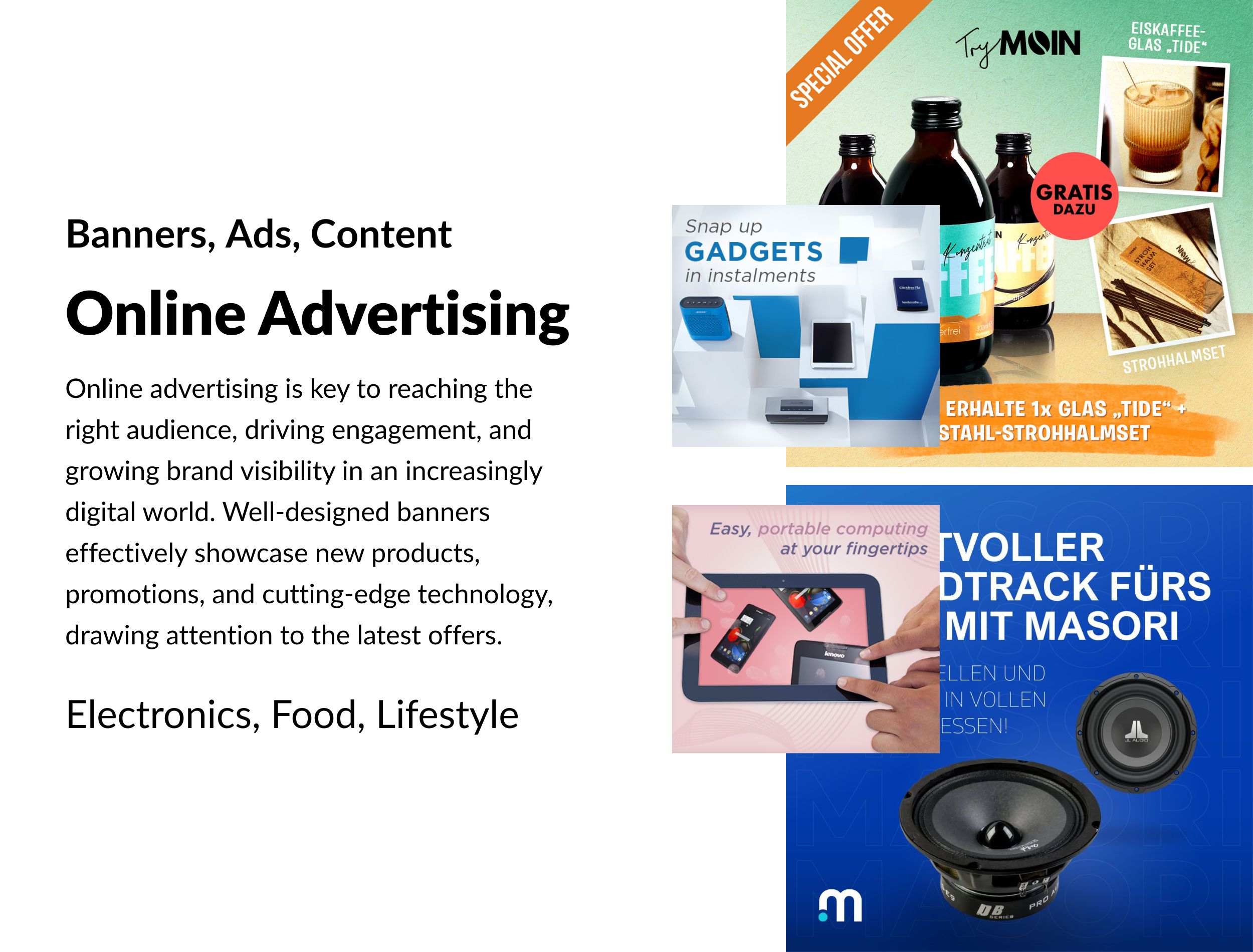
Online advertising is key to reaching the right audience, driving engagement, and growing brand visibility in an increasingly digital world.
In online advertising, I design visuals that capture attention quickly and communicate messages clearly. My goal is to create ads that not only stand out but also drive engagement and conversions. Effective design makes all the difference in delivering impactful campaigns that connect with the right audience.
Online banners play a crucial role in the electronics niche, serving as powerful tools for both brand visibility and customer engagement. In a competitive market where innovation drives interest, well-designed banners effectively showcase new products, promotions, and cutting-edge technology, drawing attention to the latest gadgets or solutions. Their visual appeal, combined with targeted messaging, helps to build brand recognition and drive traffic to websites or product pages. By strategically placing banners on relevant platforms, electronics brands can connect with tech-savvy audiences, fostering both awareness and conversions through an immediate and impactful online presence.
I helped an e-commerce company in the electronics niche design engaging online banners that boosted their product visibility and conversions. By focusing on clean, modern layouts and highlighting key features of their latest gadgets, I created visually appealing banners that resonated with their tech-savvy audience. My designs were optimized for various platforms, ensuring consistency and brand recognition across the board, while strategically placed call-to-actions encouraged higher click-through rates and improved sales.

I worked for Thoman Laine, an e-commerce jewelry business, to design elegant and eye-catching online banners that showcased their unique pieces. By focusing on a sophisticated aesthetic that matched their brand’s luxurious feel, I crafted banners that highlighted the intricate details of their jewelry. The designs were tailored to appeal to their target audience, with subtle animations and well-placed calls-to-action to drive traffic to their product pages. The result was a significant boost in online engagement and increased visibility for their collection.

As an example of a campaign I provided creative direction for myToys' Back-To-School campaign, capturing the excitement and anticipation a new school year brings for children. It’s a time of fresh beginnings, new adventures, and a chance to express individuality. I focused on creating visuals that conveyed that sense of possibility and enthusiasm, using bright, playful designs that highlighted essential items like backpacks and school supplies. The campaign's imagery, as all other promotional material that I ever created for myToys' fashion and toys departments, was vibrant and fun, designed to resonate with both kids and parents, while ensuring the products were prominently featured in a way that sparked excitement.

I worked with TryMoin, an e-commerce coffee shop brand, to design vibrant and engaging online banners for their ads and social media platforms. Coffee is more than just a product—it's an experience, and I made sure the designs reflected that. I focused on creating visuals that captured the warmth, richness, and community feel associated with coffee culture. By incorporating enticing imagery of their brews and highlighting key promotions, my banners helped boost their brand presence, increase engagement, and drive sales. The designs resonated with coffee lovers and reinforced the brand’s identity as a go-to for quality and connection. It was a great chance for me to experiment with colors and forms to run riot creatively.

I also designed both static and animated images for TryMoin's Meta ads, focusing on delivering clear and impactful visuals. It was challenging to select the right layouts that balanced creativity with functionality, ensuring the ads weren’t cluttered while still being visually engaging. I carefully structured each design to highlight the key message, making sure it was always clear and prominent to the viewer. Through thoughtful placement of elements and maintaining a clean design, I created ads that grabbed attention, communicated effectively, and drove results without overwhelming the audience.

I worked with a performance marketing agency for Masori, an electronics store specializing in car electronics, to design static online images for their ads. The client was very challenging and demanding, pushing for perfection in every detail. We went through many iterations to refine the designs, ensuring they met their vision for clean and modern layouts. I carefully selected a color palette that aligned with their brand while making the ads visually striking and professional. It was crucial to balance bold visuals with clear, concise messaging that resonated with their audience. In the end, we achieved designs that effectively showcased their products and boosted their brand presence.

From the iteraction with this client I learnt that less is definitely more and that it is important not to overwhelm the clients with options and possibilities. The designer needs to find a way to finalize a project and not to lose oneself in an endless number of petty details. At some point design becomes purely subjective, and we don't do the client any favors by updating any subtleties that won't have any real impact on sales and customer behavior. I believe it is the designer's responsibility to ensure that a design workflow progresses steadily toward a visible end goal.

Here's a selection of a number of banners that I designed for 4 different clients, either through performance marketing agenceis or being directly involved with the client. As you can see from the number of material it all depens on the brand's key messaging, the product or service they sell, and the existing Corporate Identity that they utilize on their website. With this knowledge I was able to create the right look and feel for the customer's needs.
Barbecue & Cooking Products

Body Care For Women

Kitchen Utensils

Trekking Shoes For Travelers And Mountaineers
