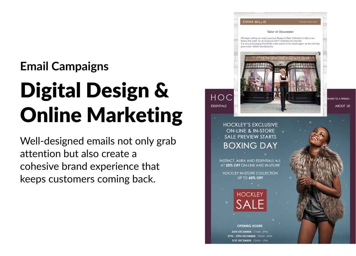
.jpg)

Design for fitness brands, creating user-friendly, engaging, and visually appealing experiences.
I created visually striking and functional landing page mockups tailored to engage and convert on desktop and mobile devices, focusing on dynamic and user-centric layouts for the fitness industry.
In the fitness niche, design plays a crucial role in motivating and engaging users. A well-crafted website can inspire action, whether it's pushing users to start their fitness journey or encouraging them to take the next step in their training. By using energetic imagery, modern typography, and intuitive layouts I created mockups and visualizations that reflect the vibrant, goal-oriented nature of the fitness world, ensuring users feel empowered, focused, and connected every time they interact with the brand.

A well-crafted interface should inspire action, simplify the journey, and keep users engaged, just like a great workout plan.
For the Vital Core concept I designed a website that exudes strength and sophistication through a dark color palette that conveys exclusivity and high-end quality. The use of warm, vibrant imagery brings energy and life to the site, showcasing the brand's commitment to empowering its users. The layout is minimalistic, with a strong emphasis on engaging calls to action and a seamless user experience, making it a visual statement and a functional tool for fitness enthusiasts.


Designing fitness logos involves blending energy, motivation, and a sense of achievement into a visually compelling mark. Fitness logos often incorporate bold typography, dynamic shapes, and vibrant colors that evoke strength, movement, and vitality. These designs must connect with audiences who value health, perseverance, and personal growth, making them instantly recognizable in a competitive industry. A successful fitness logo embodies both the physical and mental aspects of the journey, inspiring confidence and loyalty in its audience.

For VITAL CORE, the focus was on reflecting the brand's emphasis on core strength. The logo shows chiseled muscles and the central role of the core in fitness. The design uses a palette of fresh, energizing colors to convey vitality and renewal, creating a sense of approachability while maintaining a professional edge.

For PowerZone, a fitness workout planner application, I designed a sign-up process that enhances user experience and encourages seamless onboarding. The dark color palette conveys a premium, energetic feel, while bold typography and intuitive navigation ensure that the sign-up process is functional and engaging. The design focuses on reducing friction and simplifying the flow, ensuring users can quickly get started with the app and begin their fitness journey without distraction.


I designed the POWERZONE logo to exude strength and intensity, capturing the high-energy ethos. Featuring bold, angular typography and a lightning-inspired or dumbbell-inspired motif, the logo embodies power. The dynamic design, complemented by a striking color scheme of dark tones with vibrant accents, reflects the focus on performance and pushing limits. It’s a design that energizes and motivates, aligning perfectly with the mission to empower the audiences.

.jpg)
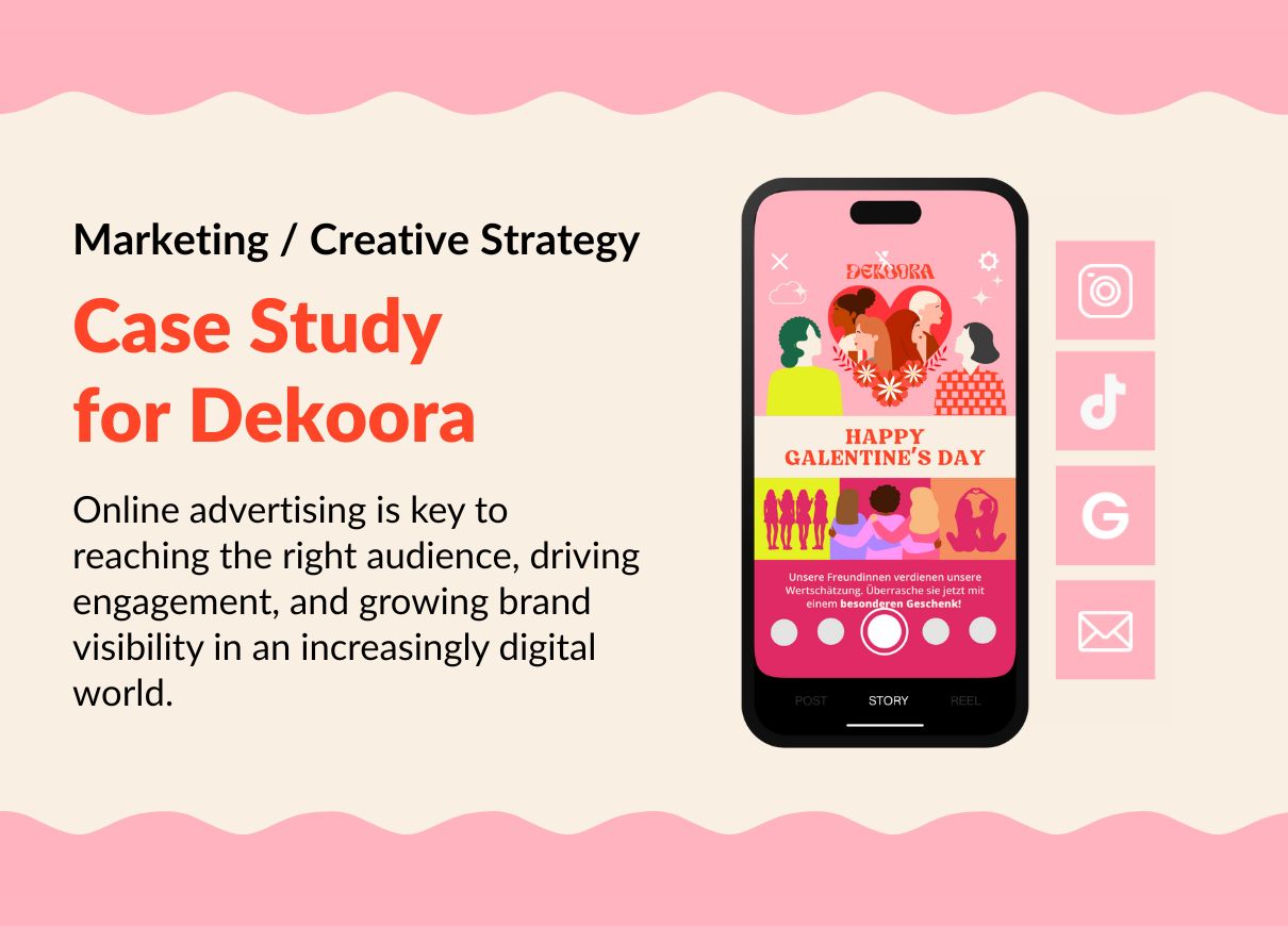
A glimpse into the case study for Dekoora - a German local brand in Berlin that turns homes into personal, empowering spaces with handcrafted, sustainable wall art.